|
|
Post by The Soul Of Philly on May 27, 2012 1:38:06 GMT -4
I got quite a few, so I've just post notables/favorites in order of how they were made, so oldest first. 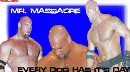 - First one, surprisingly not my worst. 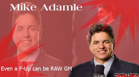 - This, this is my worst. Shame it was adamle too, I loved that guy! 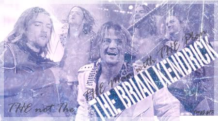 - Always liked this one. 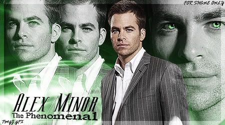 - Another one that just pops among my other work 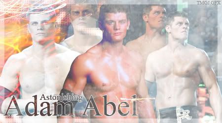 - Heads up, something about Cody Rhodes, I test something new out using him as a test guy and it comes out good for him, not so well as the next few people I try. 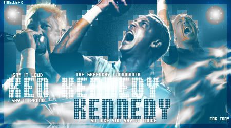 - I really liked the way the pixels came out in this one.  - I liked the color effect i used on this one. Although I couldn't tell you if it was selective color or not. 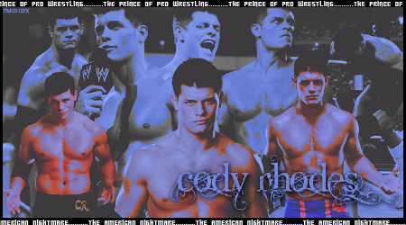 - Test #2 and another good result, at least I think. 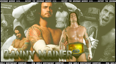 - Just trying to stroke Callahan's.....ego. 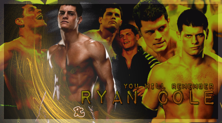 - I wasn't exactly testing anything, but it just so happen to come out better than most I had. 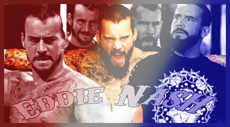 - More stroking. But I still liked this one. 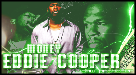 - Kash and Knuckles have seen this one before. But for the rest of you... 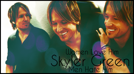 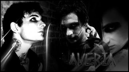 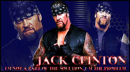 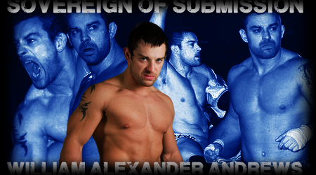 - I made this in succession and is my best back-to-back-to-back-to-back creation of my life. |
|
|
|
Post by Jason Cashe on May 27, 2012 3:31:57 GMT -4
Eddie Cooper was someone I made in order to run DHW, I remember him. Your GFX have a classy look and feel to them. Very professional grade.
|
|
|
|
Post by [ManiC] on May 27, 2012 9:07:26 GMT -4
    Really Really like all of these. The Skyler Green one has a blending and warm style I've never been able to make work, so I'm rather envious of that one. I'm not a massive fan of some of the borders, but that may be down to personal taste (I usually prefer darker borders than light ones, or opaque over translucent). Like Kash said, they seem to have a classy, refined style which I really love about them - it helps them stand out a lot more. The text (something most people often struggle with) is also very well placed (generally) and works well with the rest of the graphics (generally). Overall I'm rather impressed with them, though do feel a little let down by the borders, and occasionally the text (not fond of the text in the last two you've posted). It's good to see experimentation with styles, far too often people find a style they like and strictly stay to that one style (I've done it before) so it's nice to see someone change things up and progress styles. 8.5/10 Overall - some minor nitpicks but a very good portfolio of work. EDIT: 9/10 actually, that Skyler Green one is very, very good - I think you've turned me slightly gay for it. |
|
|
|
Post by The Soul Of Philly on Apr 13, 2013 23:15:05 GMT -4
|
|
|
|
Post by "The Real Deal" Ellis Graham on Apr 14, 2013 0:46:37 GMT -4
Two things I noticed, but beforehand I second all compliments. You produce great work.
1) Alex Minor: giving him green eyes in the black-and-white background was the single-best effect I saw. That added a haunting pop that most graphic-ers wouldn't think of, but in a way I can't explain, makes the graphic even more awesome.
2) Callahan: the idea to put Lincoln in the background was genius. It fits perfectly, but more so, it's the kind of thing that a normal person might miss the first couple of times until BAM! "Oh wait, that's not Ambrose in the background! That's Abe f'n Lincoln!"
If you get any more subtle ideas like these, for the love of your deity of choice, go for it!
|
|
|
|
Post by Jason Cashe on Apr 14, 2013 4:54:41 GMT -4
Big props on the Danny Mainer as well, adding in that ACW custom belt is a beautiful thing! Done very professional looking.
|
|
|
|
Post by Jules on Apr 15, 2013 7:10:15 GMT -4
I had to look twice before I noticed it was Lincoln. Thought it was Dr. Alexander Gray's avatar at first (I don't even know what it is, mind), then it dawned on me. My reaction was the same as Kid's - I thought was a masterstroke.
|
|
|
|
Post by warrenpeace on Apr 19, 2013 20:40:03 GMT -4
Do you use google for backgrounds?
|
|
|
|
Post by The Soul Of Philly on Apr 19, 2013 21:35:10 GMT -4
Deviant art
|
|
|
|
Post by Jason Cashe on Apr 20, 2013 13:52:23 GMT -4
I go there for GIMP brushes but I'm sure the brushed get better for better programs. What program should I go and get?
|
|
|
|
Post by Tommy Knox on Apr 25, 2013 14:57:25 GMT -4
Me, I use paint shop pro. I have photoshop but just better with psp.
|
|
|
|
Post by Jason Cashe on Apr 26, 2013 0:02:50 GMT -4
Thanks Knox.
|
|


